We have set up a new website - with all the previous content and a blog all in one. So, this one will be discontinued. To keep follow us, take a look here:
http://www.alternativephotography.com/
And to follow us, click here:
http://www.alternativephotography.com/wp/feed
Friday, April 16, 2010
Sunday, November 22, 2009
Book review: Photographic Possibilities
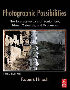
Malin read Robert Hirsch's third edition of Photographic Possibilities - and will be going straight into the darkroom after writing a review.
Heavier in weight, but lighter in it's feel comparing to the 2nd edition. This time Robert has moved from black and white images to full color, and they really lift the book.
The book is very much focussed on the users and their use of materials, even the history section highlights the use of materials, rather than the people inventing the materials.
The book is not a traditional how-to book, it is a bible of darkroom materials available at the same time as it pushes ideas, how to visualize, and how to appraise the creative process. The materials are incorporated into the process as a means of visualizing your idea.
Photographic Possibilities also does what it says on the tin, it covers b&w material and developers, how to prepare your own chemicals and toners, pinhole and toy cameras, and it even briefs over alternative photographic processes at the end. It is a bible for anyone doing advanced darkroom work, or who want to push their own working processes to the next level.
Perfect for the b&w darkroom enthusiast! Get the book on Amazon.
Monday, November 2, 2009
Fuji image transfer
How to make image transfers using Fuji instant film.
Instant Film processes in a minute or so. If the process is interrupted and the film is pulled apart, the dyes can be made to transfer to another surface, in this case called the 'receiver'. The imperfections of this process, including color shift and a unique texture, impart a unique 'look'.Image right: Fuji instant film transfer on canvas paper by Jackie Smith.
Film
The peel-apart Polaroid color films, such as Polacolor 669, are no longer manufactured. Fuji Film is now making films that are the same size and format as some of the Polaroid films. The Fuji films can be used in the same cameras that held the Polaroid films. The Fuji emulsions are, however, different in both appearance and chemical consistency. They also have a different 'look' and have more saturated color when they are transferred and use a somewhat different technique.
Instant-Film image transfers can now be made using Fuji 100c film. The process for making these is varies from the Polaroid in that the receiver should be dry, not wet, and the transfer is done in relative darkness. The process is detailed below.Source Images
Media
The media for the Source Images depends on the type of 'enlarger' that will be used. The Daylab Instant Slide Printer prints from transparencies. The Daylab Copy System Pro uses positive prints of approximately 4 x 6 inches. In both cases these can be from film or digital.
Cropping
The outside of the final print will be 3.25 x 4.25", but the actual image area will be 2.18 x 2.75" or 5.5 x 7 cm. This is an aspect ratio of 1:1.2727... that is different than most cameras. A digital camera that shoots in 3:4 will be pretty close to this aspect ratio. Pictures from other camera end up getting cropped.
Produce Source Images either on Film or as Digital prints on any of the following media:
- 35mm Color Transparency Film for use in a 35mm Format Daylab Jr. Instant Slide Printer
- Medium Format Color Film 2.25 x 2.25, or
- Digital Transparency Film at 2.18 x 2.75" [5.5 x 7 cm], for use in a Medium Format Daylab Instant Slide Printer
- Color Prints on 4 x 6" paper, or -
- Digital Prints on 4 x 5.23" paper [10.16 x 13.28 cm] for use in a Daylab Copy System Pro
Intensification
Source Images should be intensified in three ways, to compensate for losses in the process:
- oversaturate the colors in the print because the transfer will be less saturated
- add extra contrast because the transfer will be more 'flat'
- boost the reds because the red dyes do not transfer well
Equipment
- Daylab Instant Slide Printer or Daylab Copy System Pro
- Hard brayer (rubber roller) as used in printmaking
Materials
- Positive Source Image on either
Transparency Film for use in a Daylab Instant Slide Printer
Prints on Paper for use in a Daylab Copy System Pro - FujiFilm FP-100c peel-apart color Instant Film
- Receiving Material
Archival Printmaking Paper, such as Arches 88, Rives BFK, Crane, Stonehenge, etc. that is un-sized with a smooth surface (hot-press), 140 lb or more
Some other porous receiver material (optional)
The Process
1. Prepare the receiver
Tear the paper or cut the receiver material to the desired size. Don't cut printmaking paper. The rough edge from tearing is desirable. Use an acid-free printmaking paper that has a smooth surface and is non-sized for the dry-transfer method that is better for Fuji Film, (as opposed to 'medium wet' for Polaroid film). Sizing in paper will produce a yellow cast.
If using some other receiver such as cloth, wood, etc. it has to be porous to receive the ink. It should also be light in color because the highlights of the picture are transparent – the highlights will be the color of the receiver, and not necessarily white.
2. Make an exposure
Expose a sheet of Fuji film using a Daylab Instant Slide Printer or Daylab Copy System Pro. See the Instructions that came with either machine for more specific details. Set the Film Type = 3 for Fuji 100c, which is the setting for ASA 100. [Polaroid 669 is ASA 80, Film Type = 2]
3. Turn off the lights
A small night-light on the other side of the room is acceptable so you can see where the print is going.
4. Partially develop the print
Pull the film straight out of the film holder with a smooth, even gesture after the exposure is made. Do not stop part of the way through or use a jerky motion. You will not get an even print.
Wait 19 seconds precisely, then pull the two sides of the Fuji Film sandwich apart quickly and evenly. Save the positive part of the film for other possible uses.
5. Transfer the print
Turn the Instant Film over and place it emulsion-side down on the receiver material. Roll with a hard brayer. Do not allow the negative to shift its position on the receiver. Use firm pressure for about 45 seconds. Then rub the back of the print with your fingers for another 45 seconds.
6. Turn the lights back on
The rest of this process may be done in normal room light.
7. Remove the Fuji film
After waiting about another minute, gently pull the Fuji negative away from the paper. Do not let it sit too long or the print will turn dark green. The duration will vary in different environments, depending on temperature and humidity.
Start in one corner and slowly peel back the negative. If the image does not stick to the receiver, try another corner. Sometimes bubbles can form, but these can be smoothed out carefully with your fingers.
8. Neutralize the print
Instant Film chemistry is a base (as opposed to acid), and should be neutralized. Soak in a weak acid such as lemon juice. The acid bath can also intensify the colors. Mix a solution of about 1 : 4 lemon juice to water. Immerse the print briefly with agitation.
Transfer the print to a running water bath for a couple of minutes. Finally, let the print air-dry.
Chemical safety
Always be careful when developing and handling Instant Film materials. When the Instant Film prints are pulled apart, the developing chemicals are exposed. These chemicals are toxic and somewhat caustic. Keep away from the skin and eyes.
Aesthetic considerations
The thing to remember is that "Form Supports Content". The surface of the Image Transfer has a textural quality and the colors in the print shift. You should look at a variety of Instant Film Transfer prints before you begin the process. Then you should consider how the process affects the appearance of the final image. Appropriate subject matter should be shot that will benefit from this process.
Also consider using black & white source images.
Monday, September 28, 2009
Photo polymer gravure - the why's
Writer / David Hoptman
Photography / David Hoptman
 David Hoptman argues for using the process to get "hands on" photography work done, ideally combined with Photoshop.
Photography is as widely diverse as it is a generic medium by which imagery can be exploited and used in various ways but traditionally for the most part lacks the "hands on feeling" that is imparted and treasured in so many other artistic endeavours such as painting, printmaking sculpture and ceramics.
This is in no way to take away from the photographic process because in and of itself photography is and will probably always be a medium that contains an aesthetic quality that is unrivaled in its diversity not to disregard its particular Zen elegance and simplicity.
I love photography and have been involved with the medium for close to thirty years as a commercial and fine art photographer, but have never been so enamoured as I am today working with photography in the printmaking arena. The printmaking medium is the means by which the photo-sensitive polymer plate is used to access a whole new bag of creative tricks.
Printmaking is diverse in tools and modes in which to finalize innovative concepts and imagery. The freedom I have gained working with photographic imagery using light sensitive polymer plates in conjunction with the Printmaking process allows the all important personalized artistic touch to be more easily facilitated and hence realized. The integration of photography and printmaking Photo-printmaking, initiates the creation of an artistic dialogue that enables the sum to be greater than the parts. Creative process in regards to the particulars' of a medium is greatly influenced by the way in which one interacts with materials, tools and techniques innate to each particular medium.
"The negative is comparable to the composer's score and the print to its performance. Each performance differs in subtle ways."
This particular quote is one of many by the great visionary Ansel Adam's and it sums up the relationship between the photographer and the image finalized during the printing process. Today, using digital capture and inkjet printers there is now a complete absence of any hands on interface between making the photograph and the final artifact, the digital print. Photoshop is an extremely powerful tool that enables the photographer to interact more precisely while fine tuning photographic imagery than was ever available historically and has exponentially stimulated the evolving sophistication of photography. The fusion of digital photography with all its complements into the printmaking realm creates the perfect balance of advanced imaging technology with an age-old hands-on archival fine art process, Printmaking. The bridge that facilitates the synthesis between these two processes is the photo sensitive polymer plate which grounds the digital workflow into a medium that supports the all important expressive aspects of creatively interacting with materials during the printing process as we could when using the Traditional Darkroom.
Printing in the Traditional Darkroom is a hands-on process allowing the artist a tangible interaction with the medium promoting the ability to impart an aspect of his or her energetic finesse to the final interpretation of the print. The tactile stimulation that one engenders while interacting artistically with medium stimulates our fundamental creative dialogue enticing the muse to bring forth her magical gifts.
Digital imaging is a great boon and advancement in regards to photography today but it has created a chasm far greater than the one that existed before when there was only traditional photography using films, developers, toners etc. The ability to take digital imagery into a medium that is an archival fine art medium as diverse as printmaking makes it a perfect marriage for the photographic arts. Today there is a revival of alternate printing mediums in the photographic arts among them are Platinum/Palladium, Van Dyke, carbon printing, collotype, cyanotype, gum bichromate, etc. All of these photo reproduction process are wet darkroom processes that encourage the artist to interact in a corporal manor during the interpretive printing stages of the image much more so than what is possible with direct digital imaging.
From my personal point of view, today with the introduction of photo polymer plates that are non toxic as well as having the ability to reproduce photographic imagery on a scale equal with the finest gravure prints, grounded within a traditional fine art medium such as printmaking makes this a stand alone choice for those wishing to get there hands, heart and souls deep into the creative process of printing the fine art image.
Polymer gravure, like traditional gravure, allows the artist to create prints of unrivaled quality. Photogravure prints have a long elegantly smooth tonal range. The unique quality imparted by a gravure print is due to the way the plate holds a large degree of ink which it imparts through great pressure to fine paper via an etching press. This subtlety of tone, beginning with soft highlights and continuing without a break evolves through a succession of grays ending in a rich black. Many artists have followed in the footsteps of the photogravure process; among them are Alvin Langdon Coburn, Edward Curtis, Paul Strand, Brandt and Brassai. Photopolymer plates lend themselves in many diverse ways in which to approach and interact with imagery. Photoshop is still a key factor in tailoring photo images for the polymer gravure process in a creative sense, as well as allowing for the facilitation of making the positive transparency fit the contrast range of the polymer materials.
The positive is facilitated in the same way as using digital imaging to enlarge negatives for alternative processes. This process is covered in a book by Dan Burkholder "Enlarging the Digital Negative". Photopolymer materials extend the possibility to the artist to create elegant gravure type images or step into the world of creative photo printmaking with digital imagery finalized in an archival fine art medium.
Traditional photogravure is a complex technique. Working with gelatinous tissue, copper plates and etching in ferric chloride add to the intensive labor and high technical skills necessary for the process. Photo Polymer gravure is also an intaglio process implying the fact that incisions, depressions and recessed areas are the ink holding portions of the plate.
The photopolymer plate has a UV sensitive emulsion. With these plates, water is used to etch into the surface after the emulsion has been exposed through a film positive. The polymer becomes hardened by exposure to ultraviolet light. When the plate is developed in tap water the highlights which have less density on the positive transparency receive more light during the exposure and become harder relative to the less exposed areas hence the highlight portions of the image are less affected than the shadow areas during the etching process. The deeper etched shadow portions of the plate hold more ink thus printing darker values than shallower etched highlight areas. Unlike many of its predecessors the polymer gravure process is a "safer" process in regards to health issues.
"Polymer gravure is fundamentally different than traditional photogravure not only in regards to the toxicity found within the traditional gravure process in the past but also with its ease of use."
Today it is possible to buy photo-sensitive polymer plates, or films, which can be processed simply using plain water creating an etch in the surface of the plate allowing for the image to be printed on a wide range of fine art papers. The variables one encounters using plates, inks, papers, presses, and other various printmaking techniques allows a welcomed flexibility enabling the artist greater possibilities to exhibit his or her personal sensitivities.
 After finishing with the Photoshop aspects of image tailoring and the positive transparency is processed one has the possibility to work on the positive with ink washes, litho crayon, or other textural materials to add creative affects if so desired. The incorporation of hand drawn or scanned imagery into the polymer gravure process gives the artist continued possibilities to affect the final feel and content of his works. The possibility of adding a second plate to produce a duotone, incorporate collage, monotype or re-work the final printed surface with charcoal and pastel gives the artist the ability to more readily impart his personal touch to the final work of art. When the print is finalized it needs to be air dried, flattened and then numbered as to the edition and signed by its maker.
I have been interested throughout my photographic career in diverse ways in which to express myself and in so doing, I have become aware of the ways in which medium affects creative process and the final result of ones work. For many years I have also been sculpting and casting in bronze as well as working with ceramics. The diverse applications of my personal artistic endeavours have helped me to realize that tools, medium and the way in which one interacts and relates to variables within an artistic context plays a key role to the feel and production of creative works. Artistic endeavour is a means of expression and communication by which the artist's interaction with his subjective reality is realized in an objective form through the interaction of tools and medium. When one enjoys the process chances are more than not that one will enjoy the results.
Feel free to contact me when the inspiration strikes!
Friday, September 25, 2009
Book Review: Photography and the Invisible 1840 - 1900
 Book Review: Photography and the Invisible 1840 - 1900
Elizabeth Graves reviews a book of inspiring alternative process images with a surprising emphasis.
Harmonies of Art and Science
One of the largest and most inspiring collections of alternative process prints I have seen in recent years is published in the wonderful book, Photography and the Invisible 1840 - 1900, published in 2008 by the San Francisco Museum of Modern Art and edited by Corey Keller. The book was published to coincide with a spectacular collection of prints gathered from an international range of collections, which was shown at the museum from October 2008 through January 2009.
The exhibition and book have one major, unifying theme: photographic documentation of phenomena which are not visible to the naked eye.
The exhibition was especially popular with families, yet suffered from a traditional controversy as old as photography itself: are the gorgeous images on display science or art? If they are scientific, why are they being shown in an art museum?
Representation
Many of us who had some training in art or art history perceive photographs as a primarily artistic development. We are taught about photography in relation to other visual arts, especially painting. The work we usually study in an art history context owes its conceptual development to the arts that came before it. We study photographs as replacements to painted portraits and landscapes, and so we are drawn to photographs that emulate painterly styles with soft focus lenses and lyrical colors, photographs that were intended to be hung on walls or above mantelpieces. Even when we study scientific works, such as Anna Atkin's cyanotype photograms of plants, we usually consider them aesthetically.
Photography has had other contexts from its beginnings, however. This new form of recording the world was naturally seized upon by both professional and amateur researchers of all types as a scientific tool, as photography itself was born of the sciences of physics and chemistry. It was seized upon for its potential to record scientific information that was previously illustrated laboriously by hand for educational and reference purposes in areas such as botany, zoology, archeology, and astronomy. In these fields, where photography was prized for its objectivity, its reach extended beyond the traditions of art to record not only the world as we saw it, but the world as it existed beyond the sight of human eyes.
The book and exhibit emphasize this use: photography as a means of recording phenomena that move to quickly, too slowly for us to perceive directly, phenomena that are too small or large for our eyes to take in, and phenomena that extend beyond the range of visible light.
In this respect, as a means of representation of information, photography was truly revolutionary. To record a moonrise as a streak of light seems natural to us now, but before long exposures, this was not the recording convention. Drawings and paintings used idealized images of the world as your eye saw it over the course of a long gaze, not over the course of hours - nor in fractions of a second. To our eyes, the moon is always some fraction of a circle, no matter how long we look at it; to our eyes, the legs of a horse move in a blur, not in dozens of precise configurations. Artistic conventions provided idealized representations of natural phenomena such as snowflakes and lightning; photography changed our view of these things by providing information on their actual structures, varieties, and movement in scale and in increments of time we would not see otherwise.
State of the Art Versatility
The antiquarian processes we think of as "slow" were up to a surprising range of scientific recording and educational tasks, once specialized equipment was available. It is possible to make daguerreotypes and carbon prints of the surface of the moon; woodbury types of the surface of the sun; and calotype negatives of the enlarged wings of moths. Glass plates were employed to capture images for salt prints of magnified insects, albumen prints of crystals and electrical charges, and collotypes of horses in motion.
This collection shows alternative process images in the refreshing context of serious scientific tools, equal to the tasks and challenges of recording the natural world. The essays in the book note that not all processes were compatible with the science's goals - it took many failures before synchronously moving equipment could be devised to make a clear daguerreotype of the moon, for example - but that this inspired innovations that we still use today, such as astrophotography tripods. This is a reminder of what these processes and tools are capable of. You do not need a digital camera to record the flight of birds, or a lunar eclipse - such images are possible on a technologies that have been available since the 1800s.
Modernity
The introduction to the book notes that this collection of images is fundamentally modern, because photography itself has given us the conventions by which we now define our modernity. In this context, these images do not feel "antiquarian" or "alternative" - they feel modern, scientific, and quite aesthetically pleasing.
The aesthetics are another great success of this collection. The original prints on display, and the reproductions in the book, are stunning. The beauty of the images, whether gelatin prints of lightning or albumen prints of a heron in flight, are remarkable. Some images are clearly more informational than beautiful, but the same could be said of much contemporary art today. In this respect, the controversy over the question of whether the images are art or science is unnecessary: so many images succeed on both levels, regardless of their original intention, that it hardly matters.
Organization
The book contains several informative essays on the use of photography, and the plates are organized by the subject of the photos. The major themes are microscopes, telescopes, motion studies, electricity and magnetism, x-rays, and the very quirky category of spirit photography, an effort by enthusiasts to document unseen phenomena of religious beliefs. This is one of the few books where the process used to print the image is very clearly named. The processes represented are wide-ranging and impressive. While the book has no index, there are footnotes, an extensive bibliography, and a detailed summary of the catalog.
Inspiration
If there is anything I learned from this remarkable book and its related exhibit, it is that the techniques we are using from different time periods have a history of lively, interesting, serious, modern applications. We should not feel limited in our application of these tools in any respect. If amateur photographers of the past could use these tools to document the structure of snowflakes or the shape of lightning (and some of the most famous images of those subjects were created by amateurs), we should not feel restricted in our subject matter or explorations in any way, regardless of the tradition - scientific or artistic - under which we have been taught.
Wednesday, July 22, 2009
Platinotype printmaking
 Gary Auerbach recounts the personal journey that led to his discovery of the platinotype printmaking process 20 years ago, and outlines a simple technique for making your own prints using this archival and very beautiful process.
A pivotal moment in my photographic life occurred in 1989 when, having been a serious photographer for over 20 years, I took a long hard look at the work I had produced to that point.
I was disillusioned to discover that, despite having been printed on fibre based paper, selenium toned, and stored in archival conditions, many of my prints were showing signs of deterioration. I realised that, no matter how good my photographs might be, I was working in a medium that was destined to self-destruct.
Distressed, I started to search for ways to make images that would be more permanent. The Center for Creative Photography, at the University of Arizona, Tucson, houses one of the finest collections of photography in the world. There, I found early platinotype images by Steichen and Weston, as well as more recent images by Dick Arentz. Not only were these photographs magnificent, with a very special look, but they were truly archivally permanent.
Of course, in the intervening 20 years, we’ve moved a very long way, with photographic technology probably undergoing a greater transformation between then and now than in the whole of the previous century and a half of its history. But the kernel of the discovery I made then still holds true: no matter what claims are made for different inkjet inks and papers and other digital photographic technologies, not one of them has yet been tested over time. We cannot truly know that a process is archival until its artefacts have survived the centuries, like those prints by Steichen and Weston, undimmed and undiminished.
Touched by the greatness of the work I had encountered, and fired with enthusiasm, I determined that I too would undertake work in the medium of platinotype.
My reading led me to believe that the process was complicated and difficult. However, I have found that, by adhering to several easy steps, platinotype printmaking can be relatively simple and very rewarding.
Platinotype is an iron process, which uses ferric oxalate in combination with the metal salts of platinum and palladium to create the image. Unlike in a silver print, where metallic silver lies in a gelatine emulsion that coats the paper, platinum and palladium lie on the paper surface. As a result, the image is absolutely matte, with a deposit of the metal used absorbed slightly into the paper.
Getting started
The basic chemicals required for the platinotype process are:
- ferric oxalate
- palladium chloride
- potassium chloroplatinite
- ammonium citrate
- EDTA
(EDTA is a chelating agent to clear ferrous oxalate from the print). In addition, you will need:
- a dropper or pipette
- a contact printing frame large enough to hold your negative and paper in contact (or a clean, sturdy, sheet of flat clear glass)
- watercolour paper (I initially tried, and still like, Crane’s Ecru paper)
- a coating rod or brush
- developing (or cat litter) trays
- print tongs
- sugar paper
- coloured masking film
- masking tape
- blotting paper
- a pencil
- a shot glass!

No need for any acids to clear prints, and no more hypo. In fact, no more darkrooms! This process can be undertaken in tungsten light. And since you work on watercolour paper, no more photographic paper.
Platinotype is a contact printing process, meaning that your image is as large as your negative. The easiest light source to use is the sun. If you are in Northern Europe, where the sun is in short supply however, an old sun lamp will work just fine for small format images.
The negative
You can print a much wider density range with the platinotype process than you can with silver, so start out with negatives that are very dense.
EMULSION CONTRAST CHART
| Solution no | Part A | Part B | Part C |
|---|---|---|---|
| 1 | 12 | 0 | 12 |
| 2 | 11 | 1 | 12 |
| 3 | 10 | 2 | 12 |
| 4 | 9 | 3 | 12 |
| 5 | 8 | 4 | 12 |
| 6 | 7 | 5 | 12 |
| 7 | 6 | 6 | 12 |
| 8 | 5 | 7 | 12 |
| 9 | 4 | 8 | 12 |
| 10 | 3 | 9 | 12 |
| 11 | 2 | 10 | 12 |
| 12 | 1 | 11 | 12 |
| 13 | 0 | 12 | 12 |
| Part A: ferric oxalate Part B: ferric oxalate with chlorate Part C: platinum and palladium | |||
Contrast
The platinotype process offers great control over contrast. Two separate solutions of ferric oxalate will be mixed - the one that has chlorate added to it will effect contrast. There are essentially 13 grades of contrast that can be achieved.
Making your emulsion
Using eyedroppers, mix the specified number of drops of the two ferric oxalate (part A and B) solutions with the specified amount of platinum and palladium. A whiskey shot glass is just the right size for your drops. The drops of metal solution (C) will always be equal to the number of drops of solutions A + B.
Within part C, you can mix platinum and palladium however you like (all palladium, all platinum, or a mix of each). For reasons of cost and effect, I use 3-4 parts palladium to each part platinum. While platinum is 4x the cost of palladium, platinum gives more contrast than does palladium. Palladium adds a warm tone and fine grain to the print. A small quantity of platinum will give a deeper black to your image. If you make up a solution of a total of 24 drops, as in the formula, you will be able to hand coat an image of about 5x7ins.
The coating process
Prepare your paper to be coated by securing it with a few small pieces of masking tape. Once the chemistry has been measured into the shot glass, swirl it, then spill it quickly onto the paper. Spread the emulsion out evenly (using a foam brush or non-metallic hake brush) covering each area of the paper three or four times.
Mark the four edges of the area you want to coat with a tiny pencil mark. Or, to create a mask for a clean edge, you can use sugar paper or coloured masking film. You might choose to overcoat the image size by an inch or two to show the negative edge. Or you might coat inside the negative edge to make the image appear to float. The latter course conserves emulsion materials.
Stop spreading once the emulsion becomes tacky. Brushing more than necessary will cause streaks, and abrade the surface of the paper.
Drying
Dry your paper by putting it in a dark closet for a few hours, or use a hairdryer on a warm setting to accelerate drying. To ensure that it is dry, take your hand, while dry, and run it across the paper to all corners. A paper with moist emulsion will ruin your negative, so take care on this last step.
 Image right: Hoskie Benally, Navajo spiritual leader, from the series "We Walk in Beauty". Platinotype print.
Printing
Take the paper, put the negative on top of it (notches on the left for large format shooters), put it into a contact frame with clean glass, and seal it up. Using the sun or sun lamp as the light source, take a meter reading for reference. As the quantity of sunlight goes up, so printing time will shorten. As the value goes down, printing times will increase. Do a test strip, just as you would in silver printing. Let's say you estimate a starting value for exposure at eight minutes. I would test at two minute intervals from four-12mins. A slight latent image is visible after exposure.
Developing
To develop is simple. Density of the image is determined only by exposure, not by development. Development will be visible instantly. Dam the developer (ammonium citrate) to one end of an 8x10 developing tray, slip your print face up into the base of the dam, and drop the tray to the level.
This is a great thrill, and the moment of truth. Leave the paper in the developer for 30-40secs.
Lift the paper out. The developer becomes toxic as it builds up with platinum/palladium solids, so use tongs. Draining the developer off the sheet, and put it in the clearing agent (EDTA) for about five minutes. You will have two or three successive 8x10 trays of EDTA to remove the yellow stain from the paper. Your last tray should stay clear. After 15 minutes of EDTA clearing, wash with clear water. Depending on the paper you use, 15mins to one hour of washing should be sufficient.
After washing, lift the print with two hands (saturated paper is soft and will tear easy) and put it on blotting paper to dry, or speed dry with a hair drier.
With the print in front of you, you will notice that the final density is slightly darker than when it was wet during development. Details in the print will seem to pop in the last stages of drying as the paper stiffens.Read more and see all of the images in the article.
To see more of Gary Auerbach's work see Gary's gallery
Thursday, July 9, 2009
Gum and negatives with a twist of Français

Peter Blackburn shows how variables in gum printing can alter the desired outcome of your negatives.
Before you get too excited, this article does not describe a bizarre new apéritif to be served before your favorite pot au feu. Neither will it be a treatise complete with screen shots outlining the latest PhotoShop curve for gum printing. Rather, this petit essay is designed to serve as a simple reminder or an item for consideration as to the practical, somewhat nebulous nature of contact negatives in gum work. Kindly allow me to make the following three statements for our brief examination:
* First, while contact negatives provide crucial information useful for rendering desired tonality, negatives are not necessarily the last word in creating that tonality.
* Second, while contact negatives provide essential information for image composition (structure) and definition, negatives do not necessarily provide the last word on structure and definition.
* Third, while contact negatives (those used in three and four color printing) provide information which when combined create a color rendering, negatives can not necessarily claim the last word for color output.
Here are a few preliminary notes before we begin. In all of the examples provided for this article, I have not added any additional size to my papers. If your practice is to add supplemental size, such as gelatine, the principles described below might be reflected differently in your work. Although French-made pigments and papers were selected for comparison, country of origin is incidental to the purpose of this article. The same set of negatives (all examples below are from paper negatives) were engaged for each series of examples. Finally, I avail myself to most of the products mentioned in this essay for specific purposes in my work. Feel free to try them for yourself if they can be acquired where you live.
Now — in celebration of the famous French gummist, Robert Demachy, let's take a look at those three points mentioned above as if we were discussing the matter while lounging in the amphitheatre of the Palais Garnier over a hot cup of café noisette.
Danse de deux papiers
A cold press, AKD-sized, Montval brand paper (left) and a hot press, traditional-sized Arches brand paper are compared in the above examples. The same set of pigments which do not stain my AKD papers were applied in both images. Note how paper texture and paper sizing can affect tonality, definition, even color balance. Although adding additional size, such as gelatine for example, to the Arches paper would minimize staining and provide a smoother tonality, staining and grain can be useful effects for certain pieces. As a rule, I do not add additional size to my papers. On the occasions when I do, I use AKD (alkyl ketene dimer).
Danse de deux rapports de gomme
My normal 1:1 ratio of gum to potassium dichromate is applied in an entirely gouache tricolor gum print on the left. To the right, I've increased the gum ratio to 1.5:1 and made a slight pigment adjustment. Both were printed on my usual Fabriano paper. Observe the subtle difference in tonality, structure, and definition. Making proportion adjustments in your gum/dichromate mixtures can change mood and expression. In the case above, we have shifted from a defined image (left) to a more distressed, moody concept just by changing gum proportions.
Danse de trois ensambles de colorants—corps de ballet
Above we see a different trio of French pigments dance their way through their own interpretive performance. One image above is all Sennelier, one is all Linel, and another print contains The French School pigments — I'll let you guess which print reflects which brand. The point here is that your choice of pigments and how they are combined, your chosen concentration, and a myriad of other factors (exposure, sizing, paper quality) can produce an image which significantly deviates from the intended color scheme applied at the PhotoShop stage. Through testing and tweaking, it is possible to create gum photographs which come fairly close to matching the original or intended colors. However, if you desire the more precise accuracy of say, the Pantone system, well, good luck with that.
Different pigments, whether watercolor, gouache, dry powder, or other forms, can all vary your color output in balance, saturation, and even finish. For example, gouache prints tend to dry with a flat finish while watercolor works can display a bit of a sparkle. Gouache images, on the other hand, are usually more color saturated than watercolor prints. Fillers, binders, pigment purity, and pigment concentration in tube paints can also play a role in hue and stain.
Adjustments - Curves OR Dodge and Burn Tools?
It's a Matter of Liberté
Whether printing negatives on high quality transparency material, translucent paper, or other media, there seems to be a great emphasis in gum printing circles of exploiting the curve feature in Photoshop. While I agree it is an appropriate tool which can easily help you to achieve a certain image quality, one that I would describe in many cases as homogenous, applying curves is only one among several approaches to excellent work.
And while it's true — gum curves which flatten images seem to do a great job of revealing shadow detail thereby helping to extend the tonal range of a print — it is done, in my view, at the expense of highlights, most notably specular or pinpoint highlights. I do not employ the flat negative viewpoint reflected in many (not all) gum curves for my work, preferring a bit more dynamic and contrast in the overall look. Expressed another way, I usually desire more visible cream (bright highlights) and curd (chunks of choice blacks).
Being both a graphic designer and photographer now for many years, I often seek bold, frame-filling, even frame-bleeding images which exhibit some dense blacks and bright whites along with a range of desired tones — and that's the key phrase, desired tones. Making sure that those tones carry through to the printed sheet is an objective which can be achieved through applying careful photographic skills and through a detailed interaction with the image in PhotoShop. It's there that I deliberately select which parts to dodge, burn, or make contrast adjustments to fit my interpretation for any given piece. With that stated, I am confident there are additional creative approaches to producing negatives and matrices for gum printing which are just as rewarding, just as masterly. Surely one size, or in this case, one method might not fit all. As someone who is very pragmatic in my printing approach, I especially encourage the beginning gum printer to explore and pursue all intriguing avenues to discover the appropriate negative preparation which meets your own printing objectives.
With these two images (see the article on http://www.alternativephotography.com/articles/art135.html), I've simply switched gum arabic with casein as the binder/vehicle. The look is similar to gum but the process is far easier and much faster depending upon how the casein is produced and handled. The same negatives created for gum can be used for casein.
C'est la vie
In conclusion, if you're like me and have been printing for any length of time, you probably cherish a certain paper or two, stock a favorite set of pigments, and rely upon a basic gum ratio, keeping all of those factors in mind when you photograph and create your negatives whether in Photoshop or in the darkroom. In time, you begin to develop a unique style, while eventually moving on to explore other gum expressions. How merveilleuxis it to know that with just one set of negatives, you can create a variety of moods, a selection of styles, and a range of interpretations just by the switch of a paper, a pigment, or a proportion?
Happy gum printing — may all of your work express that certain je ne sais quoi! Merci beaucoup.
Note: Casein pigment printing and gum bichromate printing in my work is almost identical in method. Casein and gum are simply switched with each other. My form of casein work should not be confused with other forms where casein is combined with salt printing, Van Dyke, and others.
See the complete article, with all the great examples of images on: http://www.alternativephotography.com/articles/art135.html
Subscribe to:
Posts (Atom)